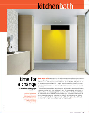
 Some people mark new phases of life with adventure experiences (skydiving, safaris) or shiny purchases (jewelry, sports cars). Others renovate. Such was the case with a retired widow who had lived in a two-bedroom on San Francisco’s tony Nob Hill since the ’80’s. That’s when she and her husband decorated the place—and it showed. Faux finishes and fussy moldings dominated, and the overall effect was dark and cluttered. Five years after her husband’s death, she was ready for a change.
“Renovating her apartment wasn’t about reinventing herself but about doing something special, creating a comfortable place to live for the next 20 years,” Michael Garcia says. Garcia Tamjidi Architecture Design was originally brought in to redo just the kitchen and the two and a half baths. But as it inevitably became clear that a limited renovation would amplify the outdated decor in the rest of the apartment, the project snowballed into something far more extensive: an 18-month, full-scale gut job. Starting fresh from just a concrete shell, Garcia Tamjidi transformed the 2,500 square feet into something unrecognizable—light, airy, and minimalist.
“It was a process of subtraction. We took away everything unnecessary,” Farid Tamjidi says. “To what was left, we applied really fine details and quality finishes.” The palette is purposely restrained. Carpet is silvery-gray wool. Flooring is limestone or pale white oak. Paneling is veneered in lightly stained oak with a horizontal grain, creating a link from room to room, and incandescent wall-washers give the oak an even glow. “Reducing the number of materials and using them in the whole apartment produces a serene environment,” Garcia says. So did eliminating every bit of visual clutter. Walls float ¾ inch off the floor and are outfitted with a recessed picture rail at the top. Kitchen and bathroom cabinets have hidden finger pulls along the edge, eliminating the need for hardware.
Though the owner loved the minimalist approach, she worried about what guests might think. So Garcia Tamjidi designed an exuberant powder room with a rare burst of color and pattern: walls in robin’s-egg blue, a dropped ceiling glittering with glass beads, and an accent wall clad in narrow chocolate-brown ceramic tiles. In front of that accent wall, a clear glass sink adds an ethereal touch to a massive granite vanity. “This room is the project’s precious jewel, the hidden surprise for visitors,” Tamjidi says.
Garcia Tamjidis’ subtly playful touch extends to the master bathroom’s ovoid fixtures and gooseneck fittings. The teak platform beneath the tub and a limestone drain plate in the shower both feature cutout detailing in a subtle teardrop shape that reappears in several guises throughout. It’s also notable on the stainless-steel latch pulls on closet doors in the master bedroom and utility room.
In the kitchen, cabinets with doors of white back-painted glass seem to hover over gray-veined white marble counters, an effect heightened by a matching glass backsplash and under-cabinet recessed linear fluorescents. The base cabinets are stained a shade darker than the oak used elsewhere, distinguishing this utilitarian space while maintaining a connection to other rooms. Right off the kitchen, a peaceful breakfast nook is where the owner sits in one of two blue leather-upholstered armchairs to drink her coffee and read the morning paper.
The level of thoughtful customization achieved in this project is rare, but Garcia and Tamjidi are quick to credit their client. “She was willing to invest time and money to have prototypes made, to go beyond the sketch. Some clients are too busy to care,” Garcia notes. Her curiosity and excitement were not only gratifying to the designers but also, in the end, rewarding for herself. On a recent visit, Garcia confirms, she was dancing around the living area in her socks.
